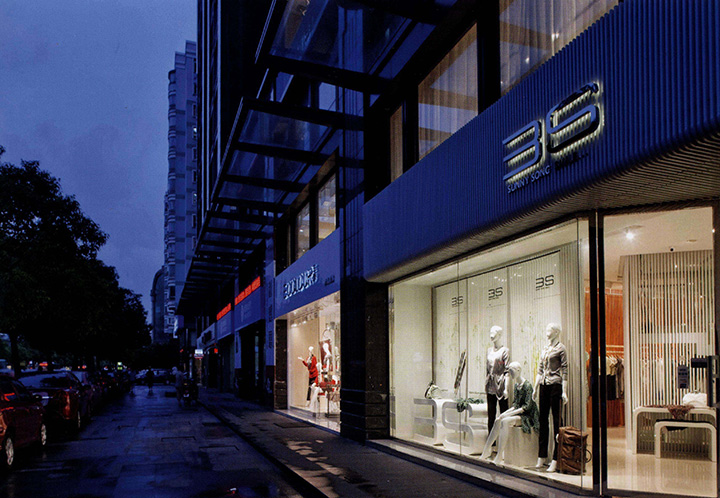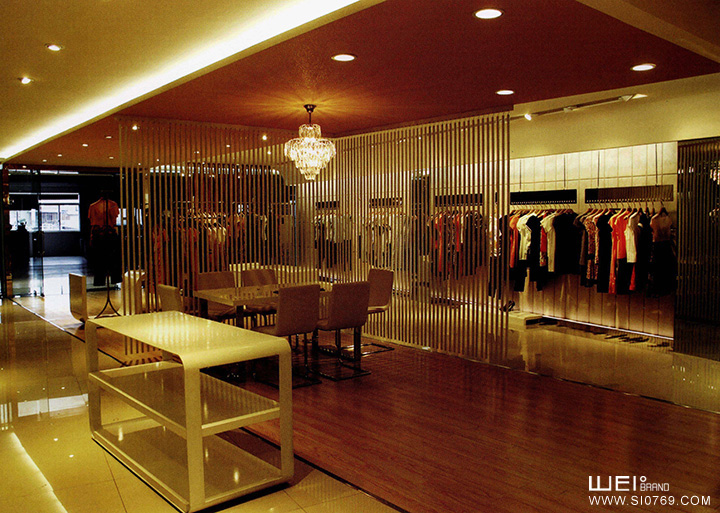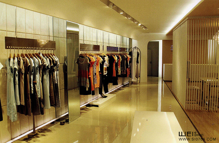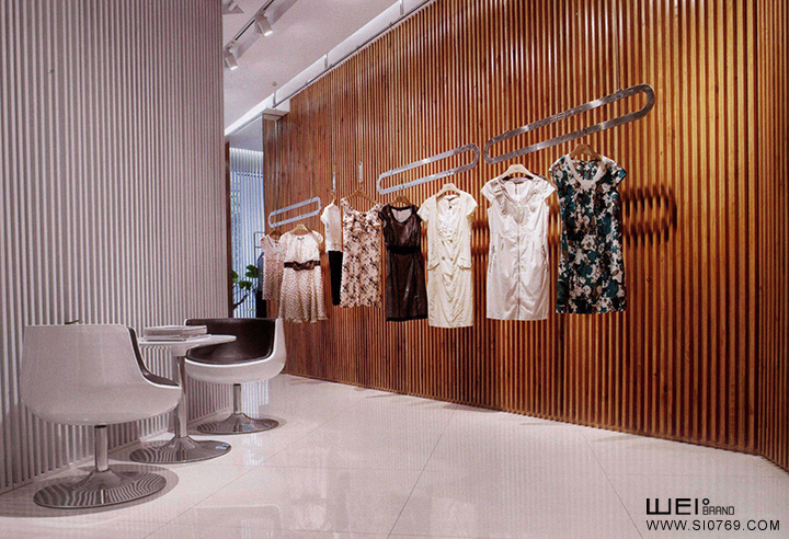
本案在3S 2007年的形象基础上进行提升,目的在于提升品牌价值,提高品牌知名度。因此在设计中延续了原有的格栅元素,但是进行了变异处理。以暮色衬托卖场温暖的氛围;栅格在使用上,比之前更为大胆透彻,栅格将门头包至底部,彻底贯穿。另一墙面整体采用软包,将卖场氛围柔化,更为吸引女性顾客的逗留.
This design is promoted from the figure of 3S in2007 in order to promote value of brand and enhance brand identity. Therefore, grizzly screen element is continued to be adopted in the design. but using variation treatment. The wood col.or sets off warm atmosphere of sales field, the using of grizzly screen which wrap the door from top to bottom is more bold. The other wall integrately adopts soft roll, soften atmosphere of sales field, attract female consumer to stay.


