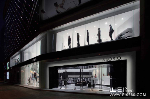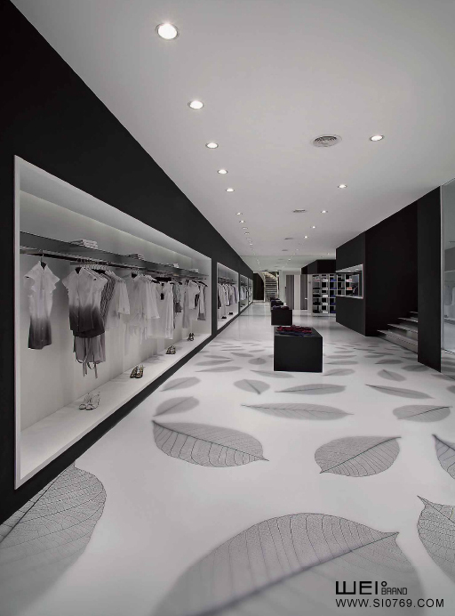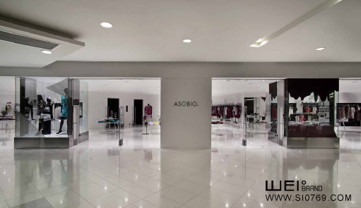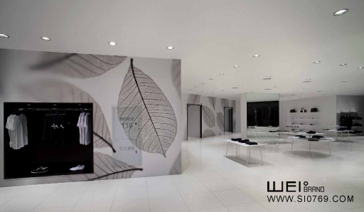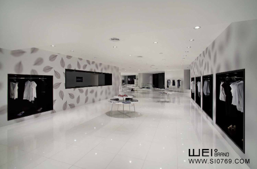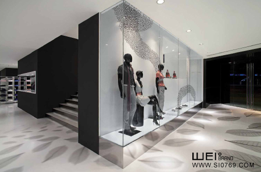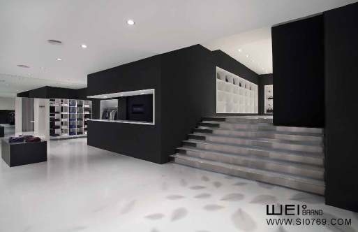
Fashion brand ASOBIO's first street shops is a spacious double shops, interior has a lot of openings, "focus" is the theme of the shop, so we put the monochrome pictures placed on the floor and wall, and change their size to imitate the camera zoom lens effect, at the same time with the sharpness of response out of focus.These effects enhance the depth and continuity of the space, provides diversity, store the existing way and also within the scope of "focus" on the display of goods each other contrast, highlight the goods.
